Additional Plots
Figure 5
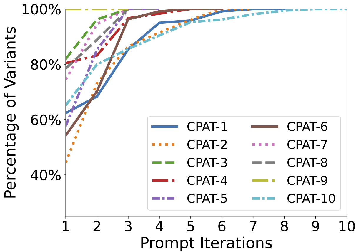
The figures below describe how the total number of variants generated changes by querying the LLM repeatedly with the same prompt. The x-axis shows the number of prompts, and the y-axis shows the percentage of variants generated.
The figure seen below is the one present in the paper. It shows the average behaviour across all chosen temperatures.
The figures below are supplementary, they depict the behaviour for each of the chosen temperature values.
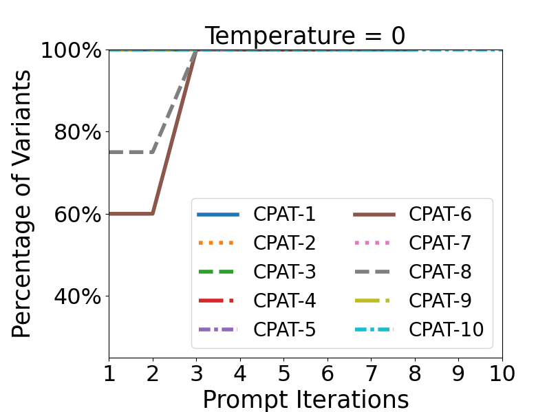
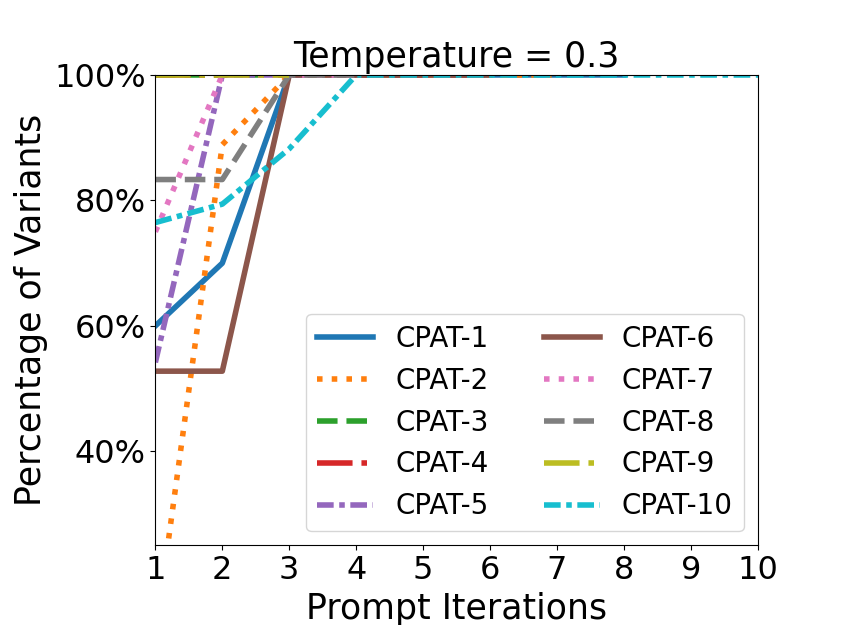
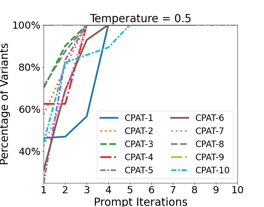
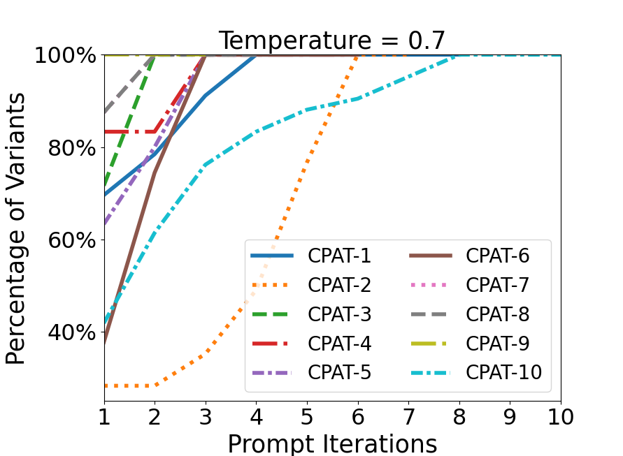
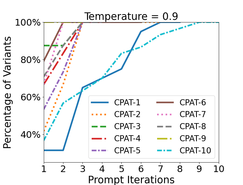
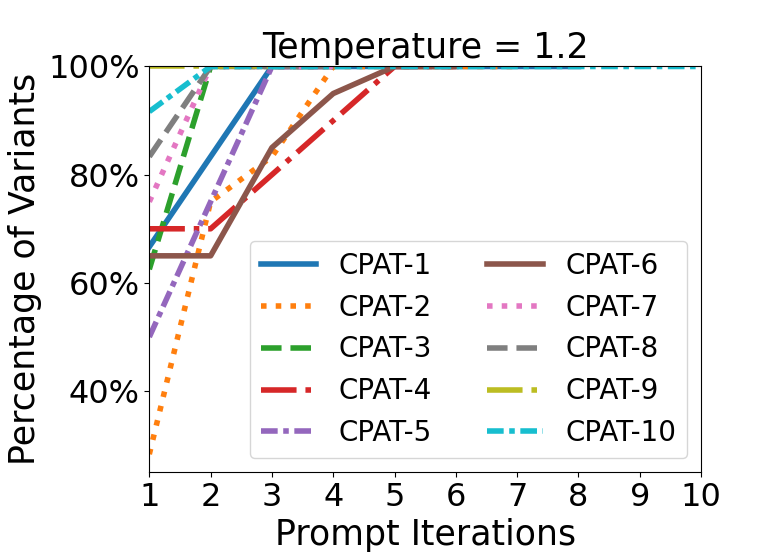
Figure 7
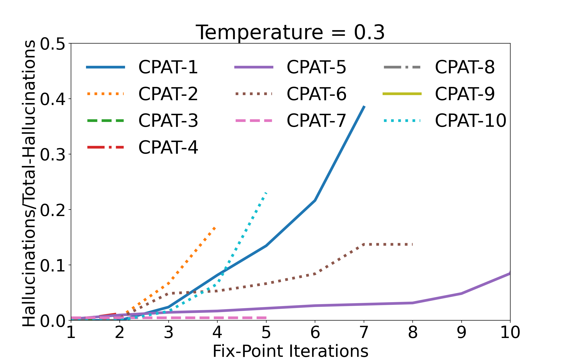
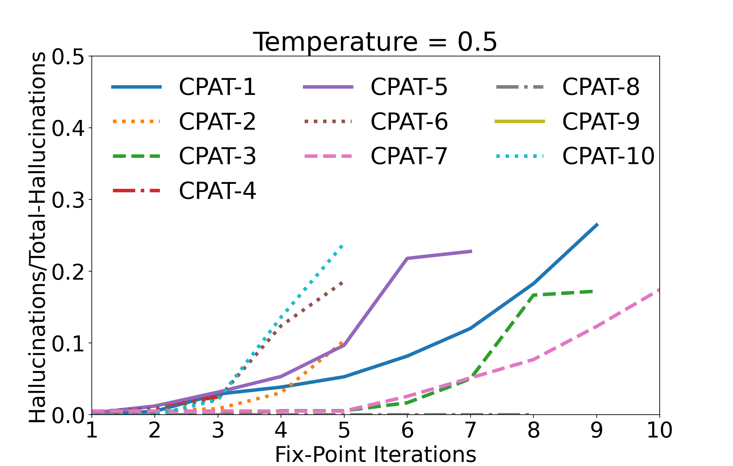
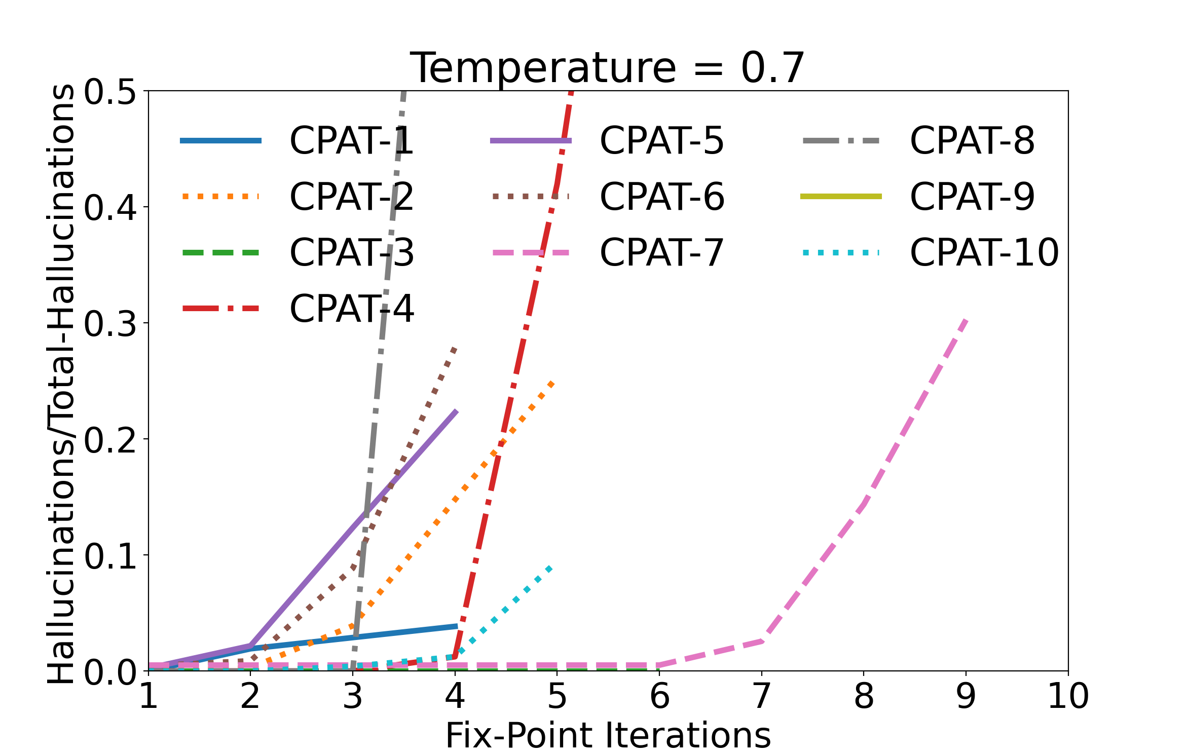
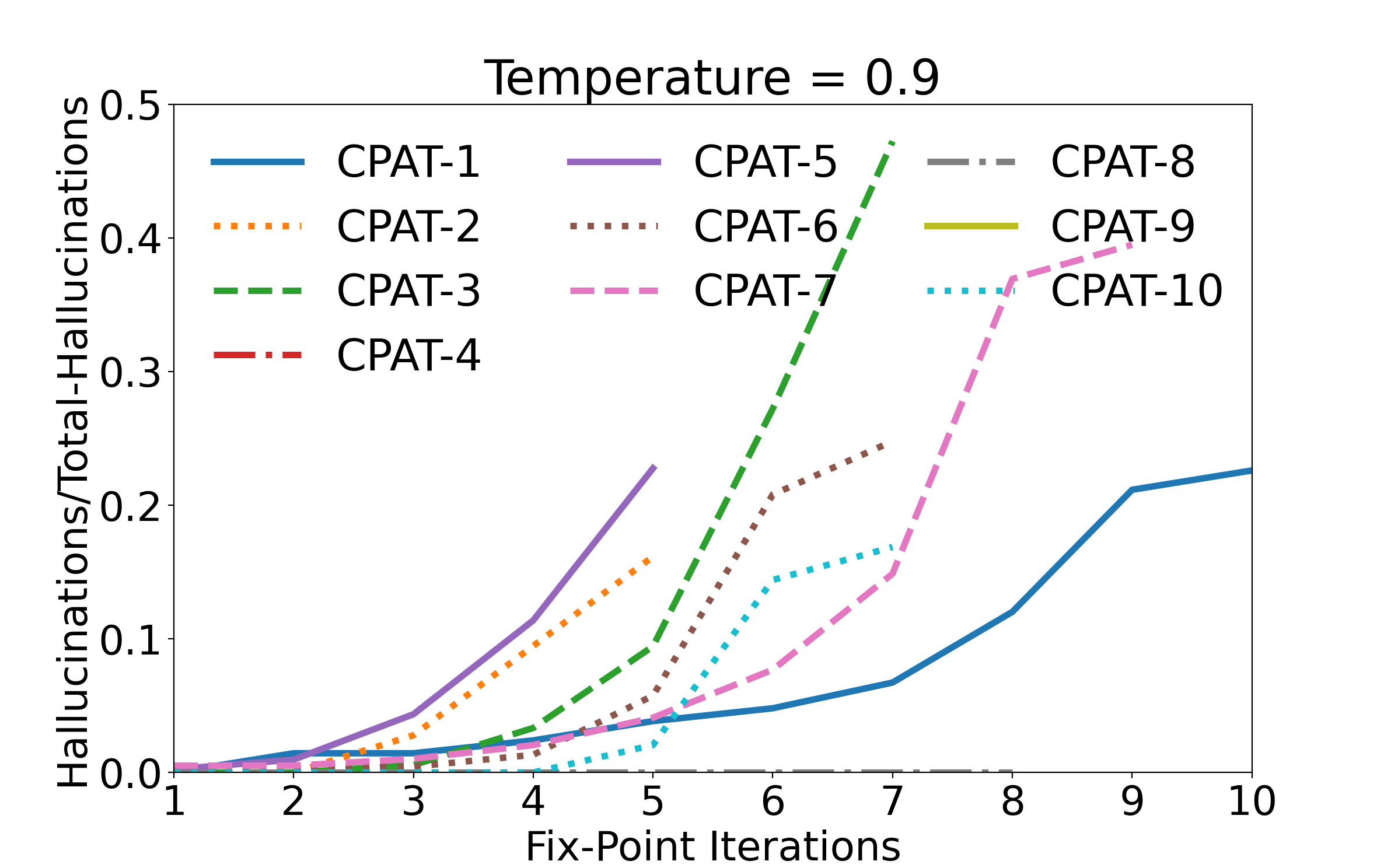
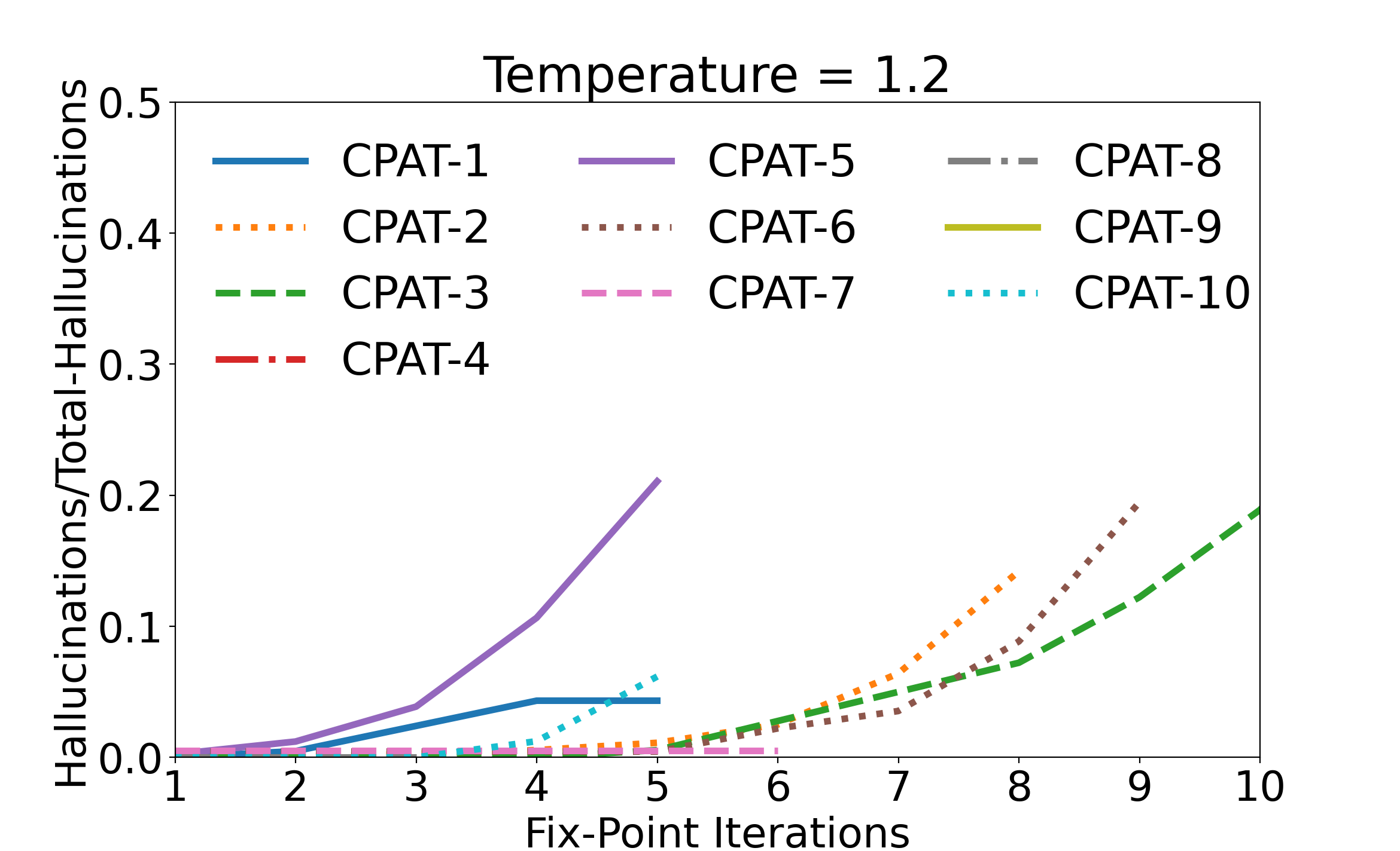
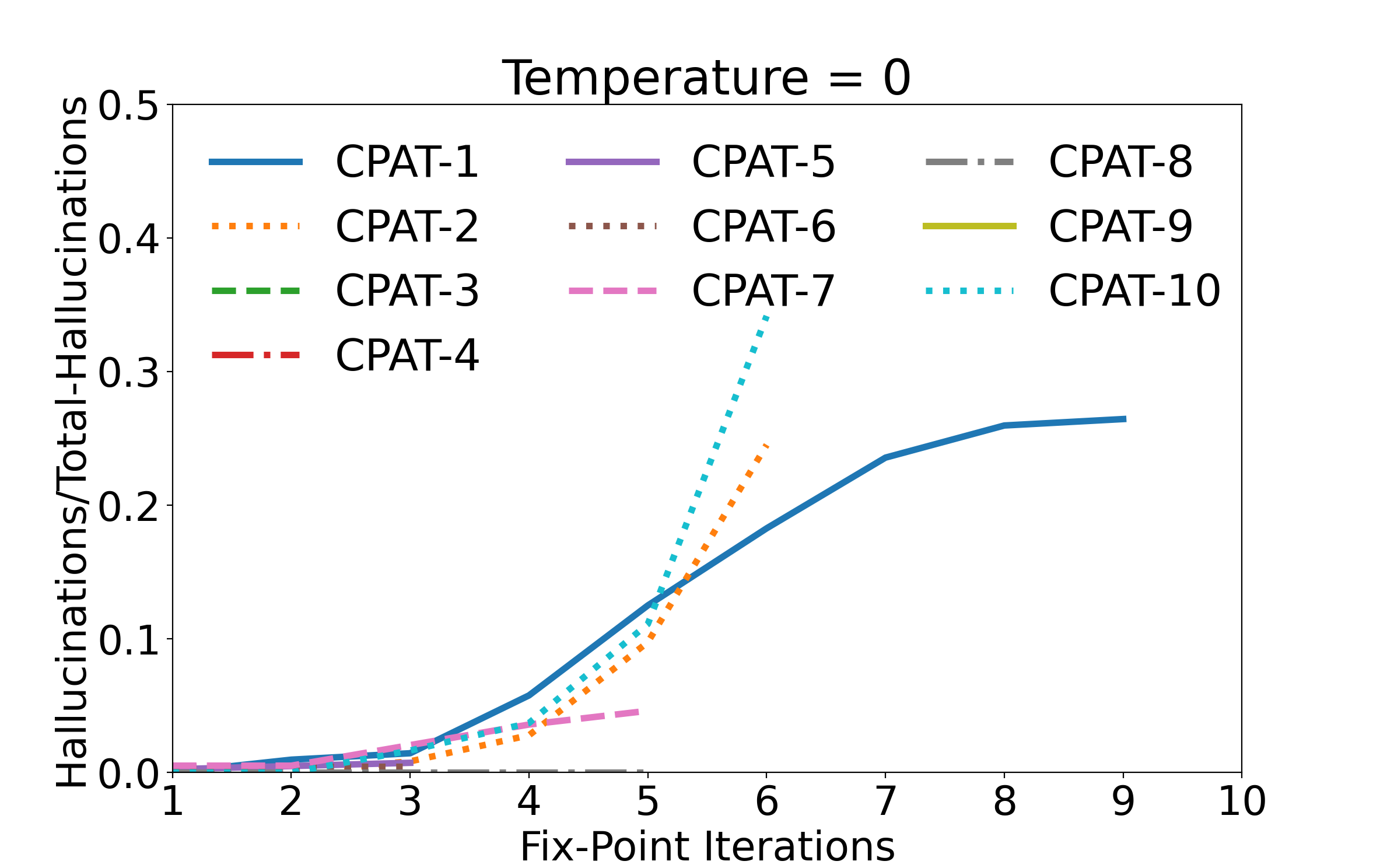
The figures below describe how the number of hallucinations increases with the increase in number of fix-point iterations.
The figure seen below is the one present in the paper. It shows the behavior for temperature 0.
The figures below are supplementary, they depict the behaviour for the remaining chosen temperature values.